
The Barton home tour is here! This house was so fun to design. I added so many elements to this house that I wish I had done in my house that it made me kind of jealous! Like these address letters! So fun! You can shop all the selections in this house at the bottom of the post!
-The Front Elevation-
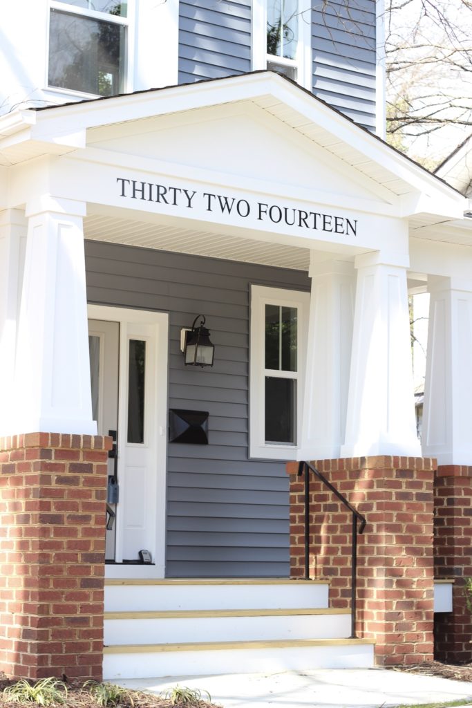
The other thing I love about the front elevation of this house that was maybe $200 extra was the way we laid the sidewalk. Its a small detail but I think it makes this house look so much more high end and custom.
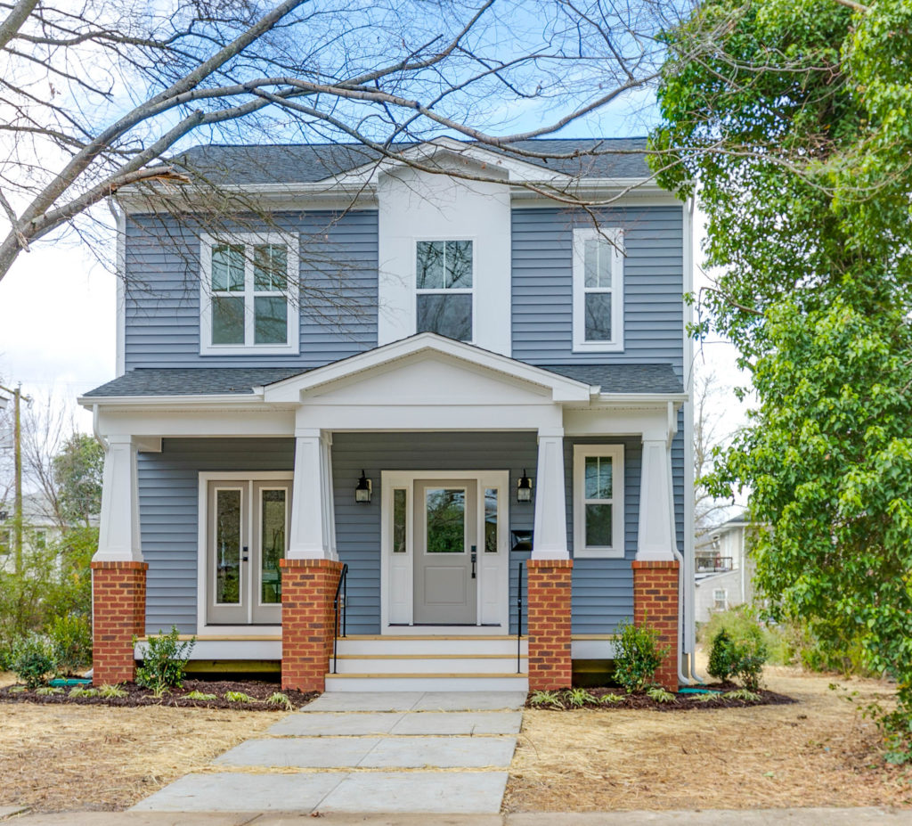
Funny story before we move to the inside! The house was actually supposed to be white! One day Dave called me one day and said the siding guys were hanging the siding and that he loved the blue but and was surprised it wasn’t white.
I knew for sure he was kidding…there is a running joke in our family that I only build white houses other than our house(which is what compromise and marriage look like 🙂 ) But no, sure enough, IT WAS BLUE! I scrambled to try to remedy the situation but what was done was done. And honestly, I LOVE it! I think it makes the house really pop and I’m so glad we ended up with an accidental blue house!
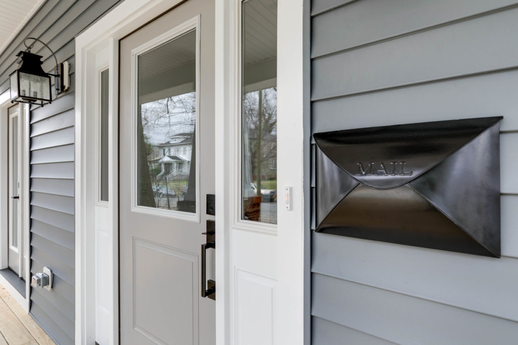
Ok, one more before we go inside! I love this envelope mailbox from PotteryBarn and these lights are amazing! We did pressure treated decking which is a place you can REALLY save some money and upgrade later! If you are building yourself and looking to invest in statement pieces like a cool door, or great tile, skimp on the decking and come back to it!
Pressure treated can be stained and sealed and really for a few years before it starts to look weathered. Better the decking than the kitchen cabinets! Another thing to note is the door. We did a half light with sidelites. The sidelites add some fullness and richness to the front elevation while also letting in more natural light!
-The Entry-
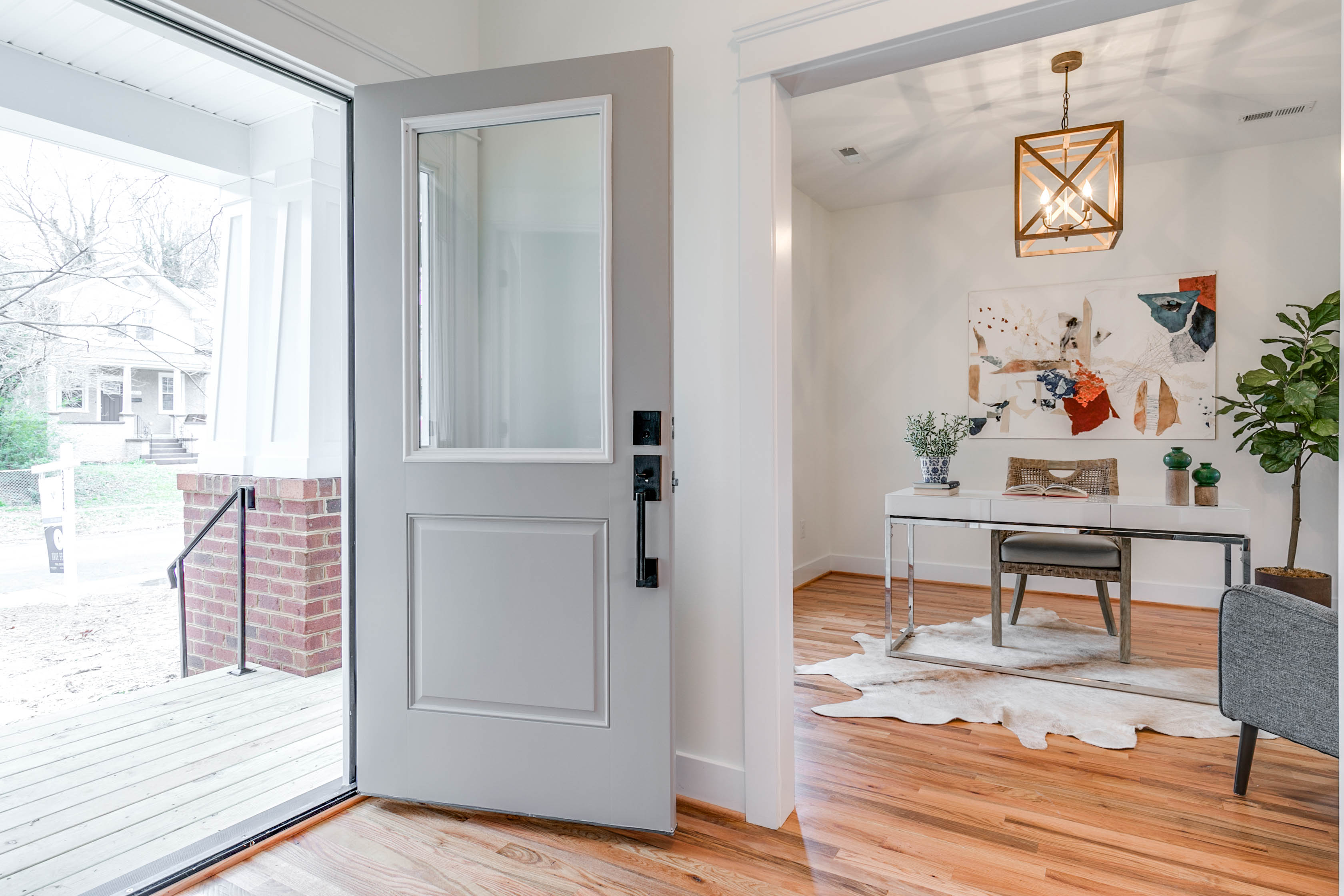
I am obsessed with these Barton home tour floors! And all we did was put a clear coat on these beauties. If you are in love with that whitewashed look you see all over Instagram but are trying to save some money when building a house I would recommend white oak floors with a clear stain. You get close to the same look for a fraction of the cost. Another option is engineered hardwoods.
I will cover this in a later post because there are definitely pros and cons to both! The best part of floors like this which are sand in place is if in 10 years you feel like you want a different color, you can sand them down, and restain them any color you want! Just. like. new!
– The Half Bath-
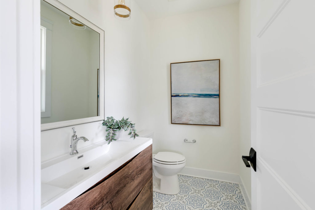
Ok, so I want this bathroom in my house! Unfortunately this kind of narrow so it was hard to get a full shot showing you the hanging pendant lights also but trust, they are awesome!! And this vanity is one of my favorite finds ever! I found it on Wayfair but when I went to order it, it was sold out! Usually, I make all the selections for a house before we even break ground so sometimes I run into this problem. BUT I managed to find it on Amazon! Who even knew Amazon sold vanities?!
And the tile! Let me just start by saying that I am a person that usually goes by the rule of “more expensive is better.” I know. I know. Foolish. But not with home decor. I have learned that there are a couple of places to spend money but where IT DOES matter, but for the most part, the same companies are peddling the same stuff. Find the less expensive option and roll with it. Like this tile for instance. Cement tile costs maybe $8 sq/ft. Which adds up quickly! But who cares if its cement? What you are looking for is the fun pattern! And with screen printing, you too can have a tile with a fun pattern for $0.99 a sq. ft.! How amazing is that?! Not to mention I am sure its much less cold on bare feet in the winter!
– The Office-
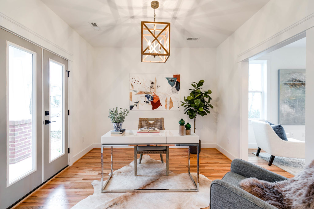
So when we designed this house I told Dave, “there need to be two living spaces downstairs.” A must have I learned really after having a baby. If I could change anything about our house, I would make our downstairs have more of a distinct family room or office! I loved this light fixture because I felt like it would transition well across any style of furniture! In this photo, you can also see the trim a little better. We went with more of a craftsman style trim above the doors and windows and more of a modern style for the baseboard. Its very simple, which I love!
-The Dining Room-
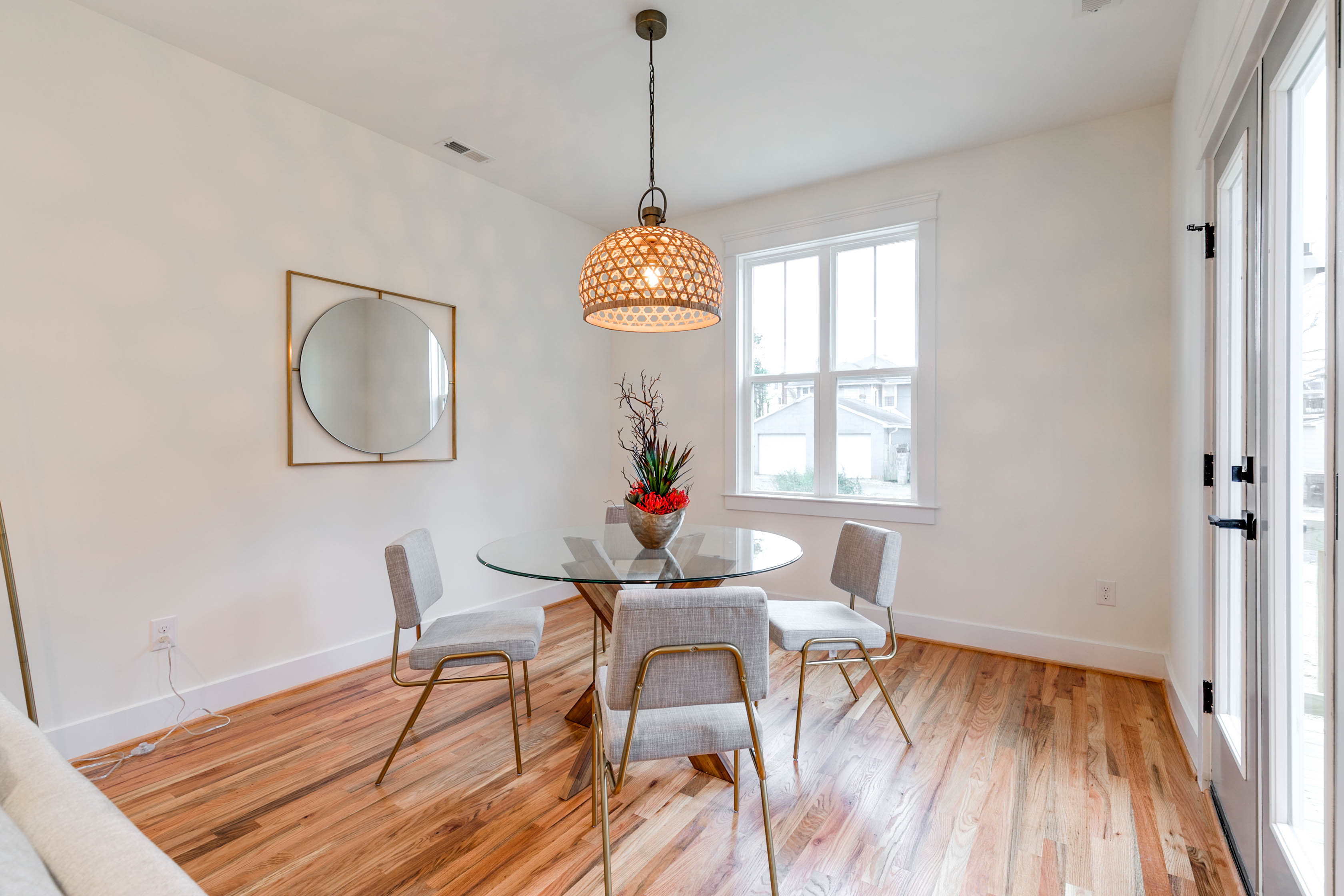
This light fixture was risky. I wasn’t sure if it was too taste specific. Dave wasn’t into it. But in the end, it was a big hit! We sold this house with multiple offers in a couple of hours so, for the record, whicker is cool. Okurrr?! I feel like I am just kind of hitting my design stride and really leaning into my style and this light fixture. is . my . style. A little boho, a little beachy, trendy, but also pretty affordable. So if you want to switch it out in 2 years, you won’t feel guilty!
-The Kitchen-
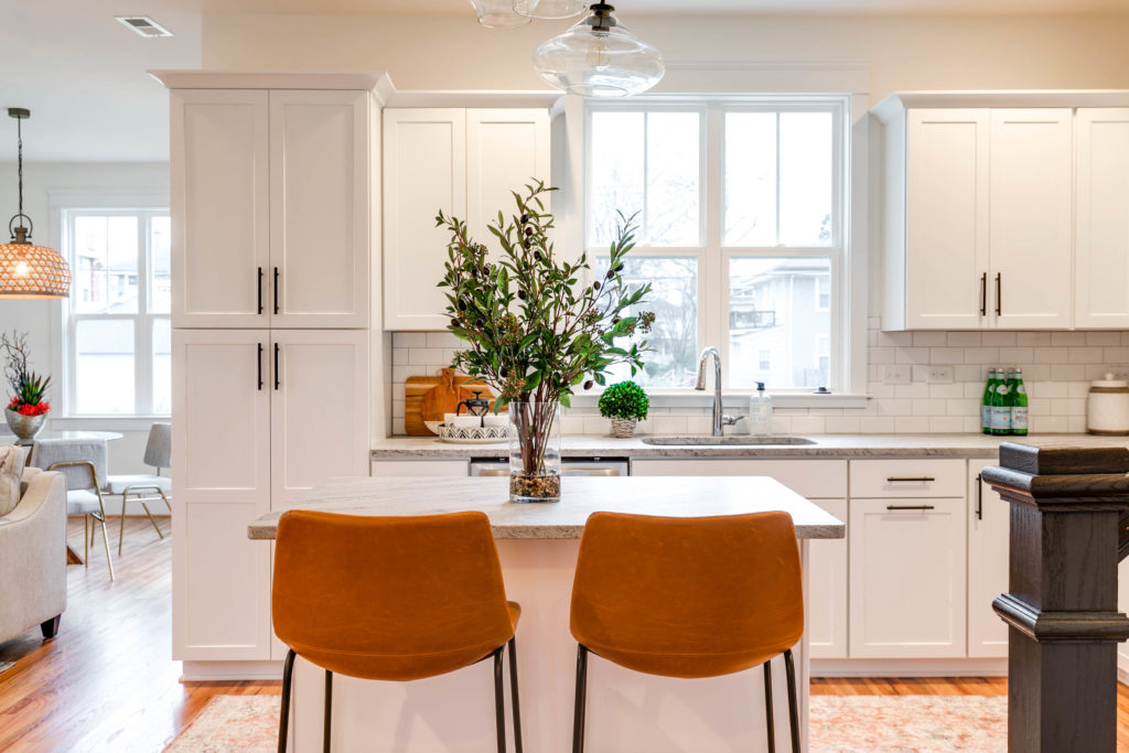
This is one of my favorite kitchens! I just love this line of cabinets! It’s quality, affordable, and you can get a high-end full overlay look! Cabinets come in three styles, full overlay, partial overlay, and inset. Inset is pricey but full overlay can get you that look for less! I am also really feeling these black pulls!
We skipped the farmhouse sink in our last three builds. Honestly, I am kinddddd of over them. I mean not that they aren’t nice and pretty. But they are pricey. I think if you are looking to save some money, skip the farmhouse sink if you don’t have to have it! I personally think the cleanness of the undermount is very nice. And if you don’t believe me, check out all the 349034590384 homes on Instagram that have Sub Zero refrigerators and no farmhouse sink. We have one at our house and its been a challenge to protect it from knife scratches. Build.com offer a less expensive plastic option here, but I haven’t used it and can’t speak to the quality. Grout color is Mapei Silver.
Again….more expensive…not always better.
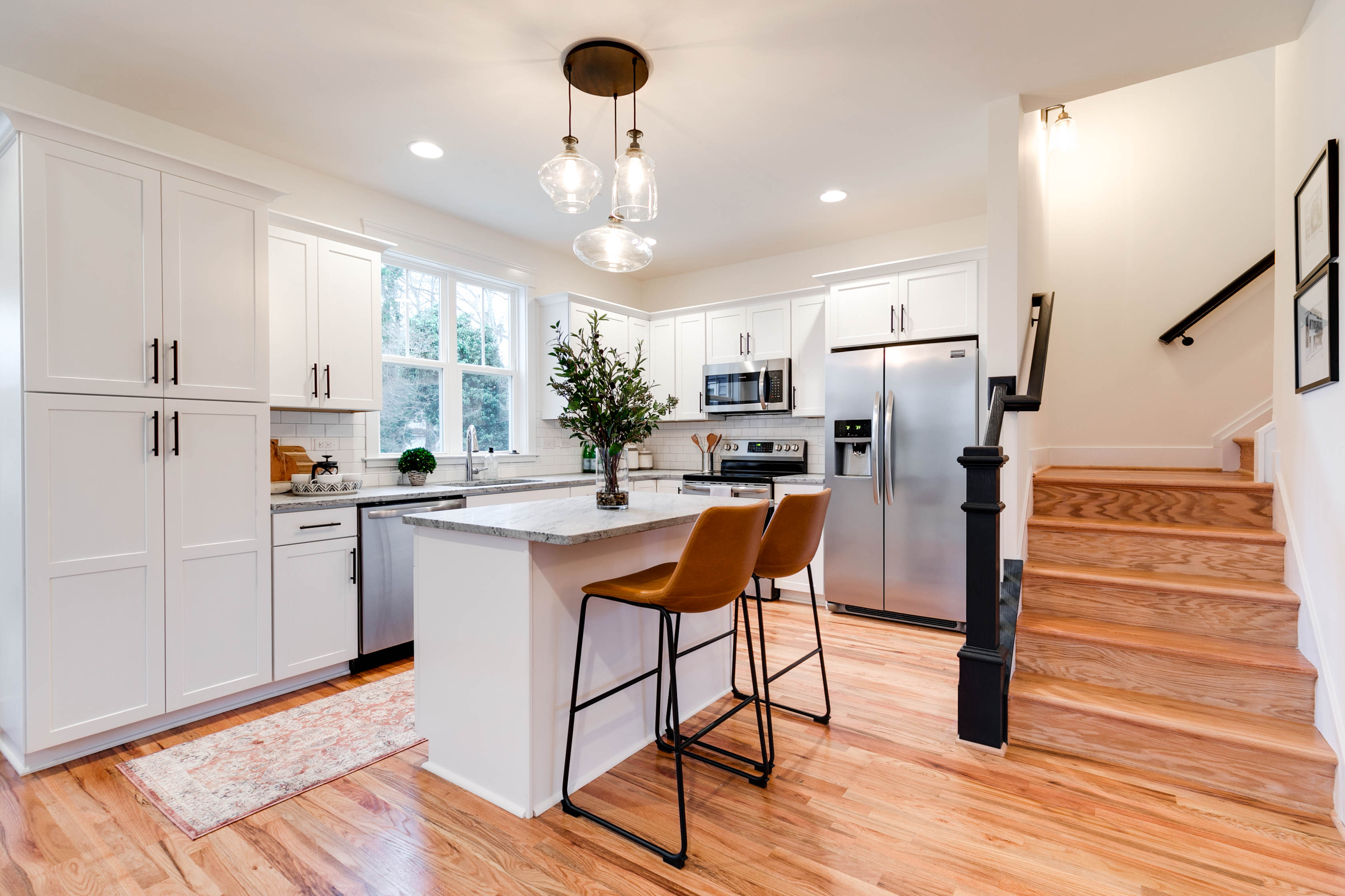 This light fixture was perfect for this island. It’s a smaller island so two lights would have worked if they were small but I thought it might just draw attention to the smallness of the island. This larger 3 tiered light from Pottery Barn really makes the space look grand!
On a side note, we painted the newl post black as well as the banister. I just wanted to draw attention to that in case you were wondering what direction to go. We do it in almost all of our houses. I like the contrast. Especially in our more historic homes, which this is not, but I liked to break it up from the floor! I think white would have also looked nice here!
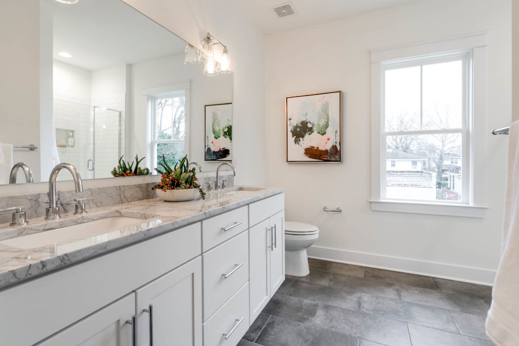
-The Guest Bath-
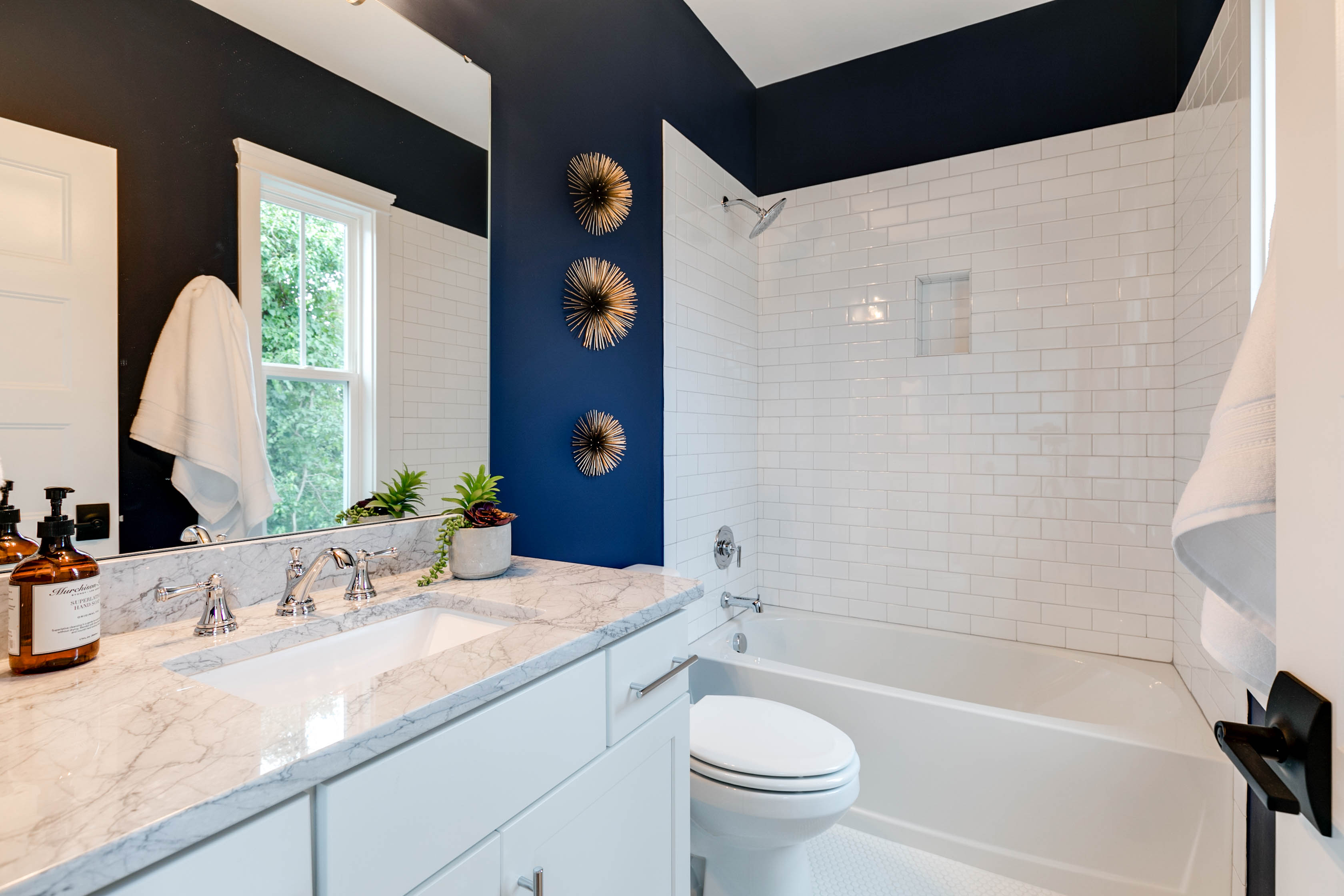
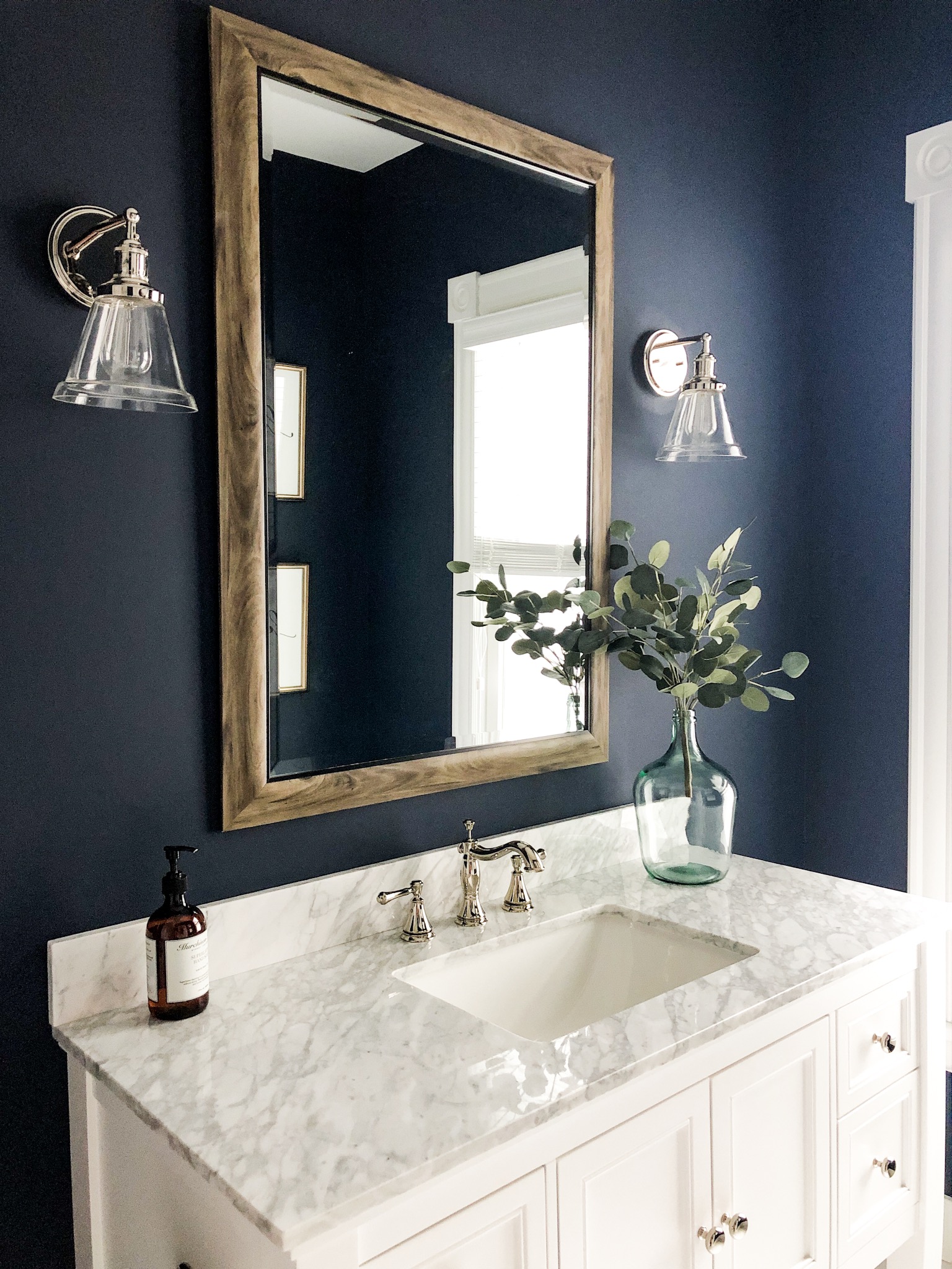
So truthfully when the photographer came out to shoot this house it was basically the darkest day I have ever seen. Usually, we shoot with the lights off but I don’t think they could pull in enough natural light so this paint color looks a little different than it usually does. This is one of my FAVORITE paint colors! I have used it in 3 bathrooms now. You can see a more accurate portrayal in the photo below.
Also not featured but dearly missed is the vanity light. And the star of the show is the penny tile. White penny tile is so fun! It’s affordable and goes with everything! Works in a shower, a bathroom, a laundry room! You name it! The shower surround is grouted with Mapei Silver and the floor is grouted with Arctic White grout. The faucet is widespread. This is a very important distinction! If you are thinking of renovating or building, ALWAYS, ALWAYS, do widespead faucets vs. center set. It just looks soooo much better.
Anddddd just when I think I am done rambling I always think of onneeeee more thing! The shower head. Make sure you get a large shower head. Not only for the practicality but it looks so much nicer! I think this was only $30 more than the little rinky dink one that is an option with this package. Totally worth it.
Stay tuned for our personal home tour to shop this look!
-The Master Bedroom-
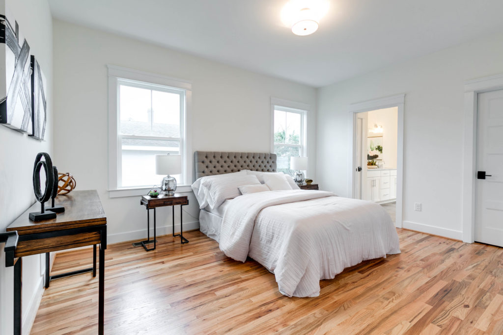 This is the master. I don’t have a lot to say about this room other than to draw attention to the beautiful hardwood floors and my new favorite white paint color. White is tricky. The wrong white paint can look too yellow or too sterile. This is BM White Dove and I think its perfect. If you are thinking of painting, make sure you try out some samples in different rooms or different walls in the same room. The way the light reflects is going to make different walls or rooms look different!
-The Master Bathroom-
I love, love, love these faucets! The clean lines are really speaking to me! The tile added some nice texture to the room and broke up all the white! Other things to point out are the cabinets. These are made by the same company that made the kitchen cabinets. Unless you are trying to get a really unique look like the cabinet used in the half bath, I always recommend getting the cabinets custom made. “Custom made” sounds expensive but it’s really not. This is probably only slightly more than if you bought the same thing at Lowes and its much higher quality. I usually go with rectangle sinks for a more modern feel and the countertops are marble.
You can shop the whole house using the links below!
Front Porch:
Mailbox by Pottery Barn
Lighting by Shades of Light
Front Door: BM – Cape May Cobblestone
Address Numbers: Custom Made
Entry:
Lighting by Shades of Light
Door Color Repose Gray by Sherwin Williams
Paint Color: BM – White Dove in flat sheen
Living Room:
Paint Color: BM – White Dove in flat sheen
Office:
Lighting by Wayfair
Dining Room Chairs by Serena & Lily
Paint Color: BM – White Dove in flat sheen
Dining Room:
Lighting by Shades of Light
Paint Color: BM – White Dove in flat sheen
Kitchen:
Lighting by Pottery Barn
Tile by The Tile Shop
Grout Silver by Mapei
Cabinets White Shaker Full Overlay by Midsouth
Faucet by Delta
Paint Color: BM – White Dove in flat sheen
Half Bath:
Lighting by Shades of Light
Vanity by Home Depot
Mirror is custom made
Tile by (Discontinued but this is similar and my new fav!) Floor and Decor
Plumbing by Kholer
Grout White Mapei
Paint Color: BM – White Dove in flat sheen
Upstairs Hall:
Lighting by Shades of Light
Paint Color: BM – White Dove in flat sheen
Hall Bath:
Plumbing by Delta
Lighting by Shades of Light
Mirror is custom made
Cabinet by Midsouth
Countertops are Carrara Marble
Tile by Home Depot
Grout White by Mapei
Bathroom Wall Color: Sherwin Williams- Naval
Master Bath:
Plumbing by Delta
Lighting by Wayfair
Mirrors: Custom made
Cabinet by Midsouth
Countertops are Carrara Marble
Tile by Home Depot
Grout Silver by Mapei
Paint Color: BM – White Dove in flat sheen
Design by Amanda Seibert
Staging by Vignettes Home Staging
Photography by Mick Anders Photography
Thanks for checking our the Barton Home Tour! If you loved some of the ideas mentioned in this article, then be sure to share on social, connect with me through the comments, and check out some of the other blog posts posted on my site. I am so excited to be here sharing my life with you and from the bottom of my heart, thank you for reading and following along.
Xx Amanda


Hi! Which faucet is it in the half bath with the dark blue walls and the sconces and wooden mirror? With the vase with the eucalyptus? If you could share the link to that faucet, I would greatly appreciate it!!
He said this was one of your favorite paint colors to use, but you didn’t say what color it is. Could you tell me what color you used?
[…] Photo Credit @amandaseibert.com […]
[…] Photo Credit @amandaseibert.com […]